Monday, December 04, 2006
New Look
Most of my readers may have noticed, and if you haven't, go see an optometrist, that I have once again changed the look on my site.
When this site made its debut back in September of last year, it was boring. White background, no fancy headers, no fancy colors, nothing, an endless vortez of white. That was when we were known as Baseball Today for Tomorrow.
During the Baseball Psychic days we switched to a black background and that's when I started playing with headers. I created this monsterous header, with a dark and mysterious look to it. Baseball isn't dark or mysterious. Well, maybe mysterious to those who don't understand the sport.
After the psychic left, we switched to Yankeeography. Having a public site called Yankeeography was trying to rob a car in daylight. It's possible, but one slip, and your busted. Yankees fans know Yankeeography to be a documentary about past and present Yankees players featured on the YES network and mass produced into four DVD sets, all which I own.
So to prevent any legal issues, we came up with a name that will stick for a long time, Bronx Bloggers. A spin on words as the Yankees are known as the Bronx Bombers.
Bronx Bloggers went through a few designs, with the first one being a Yankees jersey, that lasted about a week till I got help from a webdesigner and she created the general design we still have today. The headers were all my doings; from the Yankeeography logo, to the tacky Bronx Bloggers on the freize, to the present one.
The frieze version seemed to cluttered and gave a messy appearance on the site.
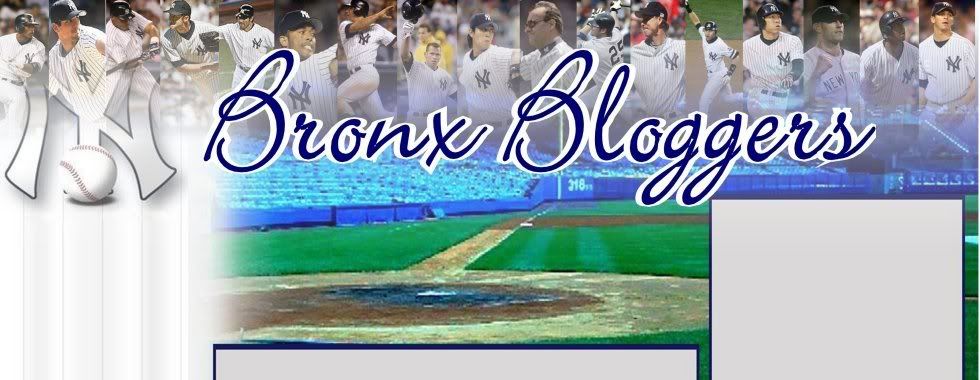
The new one is much better. I pictured all the current Yankees players except for one; at three in the morning Bobby Abreu never came to mind and will be added shortly. The players fade to the background giving us a nice even flow and a clean look, one that will last for a long time.
If you like the current header, shoot me a comment.


 Posted by Steve Kenul at 5:17 PM


 « Home


 Kokoyaku
 RetroSheet
 Baseball Reference
 SABR
SABR National Baseball HoF
 Yankees Official Site
 SportsWorld NY
 A Must Read
 Cheating Barry
 CGBB
CGBB Live Soccer Streaming
 Yankees-Chick
 The Sports Flow
 The Sports Hernia
 Sports Blog Directory
 BernieWilliams.net
 Big Reds Blogger
 Sport For People
 SportsBlog NY
 Sports Betting
 Smarter Sports Blog
 BigFlySports.com
 Sport Blog Man
